Selected work
What we’ve built.
A sample of field-data apps, dashboards, ETL pipelines, and desktop tools across rangeland ecology, university research, sports analytics, and small-business operations. Tap More details on any project to dig in.
01 · Field data app
EcoPlot Mobile · Field data-collection app
Works offline · iOS + Android Azure Static Web App Hosted SQL
A modern, cloud-hosted way to collect vegetation and ecological data, fully offline in the field, synced to a hosted database once you’re back online. Runs in the browser on any device. Standard rangeland protocols, fully customizable.
More details
Built as an Azure Static Web App with a managed SQL backend, so field crews and office analysts can collect, edit, and review from any device. Supports point ground cover, line-point intercept, frequency frames, and more, and each client deployment is fully branded and isolated with its own private database.
02 · Research dashboard
NEON Small Mammal Tracker · Ecological research dashboard
Dashboard R Shiny NEON open data Public + research
Every small mammal NEON has box-trapped, across 46 field sites, explored on a tap-a-site national map. Open any site to see who lives there and how the community is built, then follow a single animal’s whole capture history from its ear-tag. Loads instantly, works on your phone.
46 field sites
~178k real captures
145 species
More details
Highlights: the landing is a national map of every site (sized by how many animals were caught there, colored by the dominant mammal family) and a flip to “by species” maps where any one animal turns up across the country. Per site: species composition with an auto-written plain-English summary, a re-sortable Hall of Fame with rarity tiers, trap-grid home-range heatmaps, a Hill-number diversity profile, and detection-corrected abundance: closed-capture estimates (Schnabel / Chapman) that count the animals the traps missed, shown alongside Minimum Number Known Alive. Plus shareable trading-card profiles, a two-site compare, and a printable site report card.
Methods are stated honestly: reused ear-tags are flagged, Chao1 is shown as a bias-corrected lower bound with its confidence interval, genus-only IDs are excluded from richness, and the size index is an adult weight percentile rather than a hindfoot proxy that doesn’t track mass. Each site’s full record is pre-bundled into a trimmed, compressed .rds so the app loads with no network round-trip, and a monthly GitHub Action rebuilds the bundle.
![]()
![]()
![]()
![]()
![]()
The population tab corrects raw counts for imperfect detection: closed-capture models estimate how many animals were actually on the grid (typically well above the Minimum Number Known Alive, since traps never catch everyone) with a 95% interval and the per-night detection probability. Catch-per-effort, MNKA over time, and a bias-corrected Chao1 species-accumulation curve (with its confidence interval) round out the picture.
02b · The NEON explorer suite
Explore the NEON suite
Click the Driver Cascade to explore its sibling NEON flora, fauna, and aquatic apps. It fans the nine explorers out around the hub; click again to open the capstone itself, or tap any sibling to dive in.
03 · Sports analytics
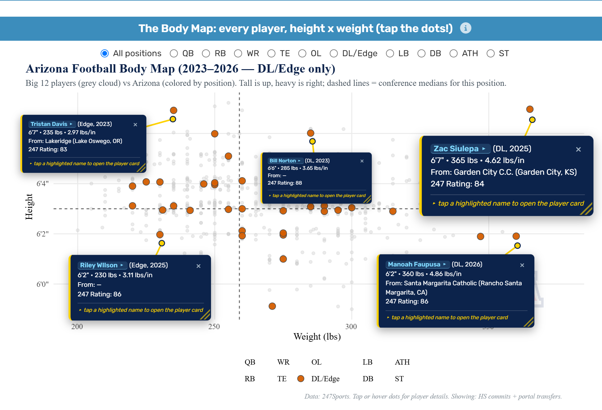
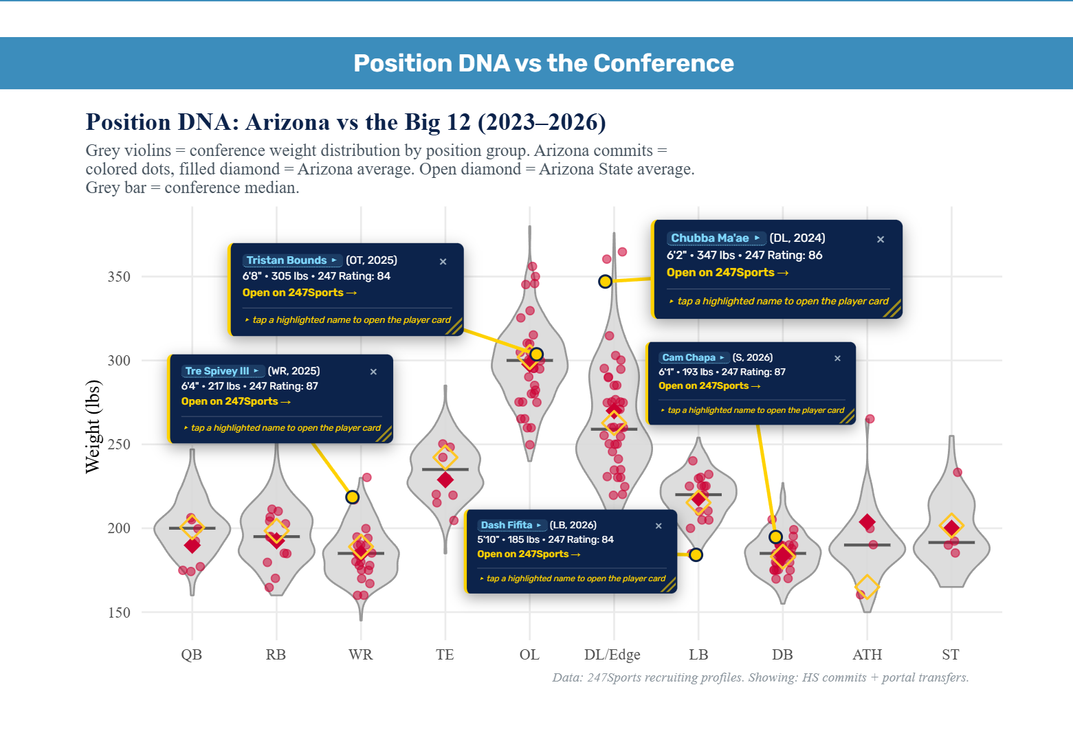
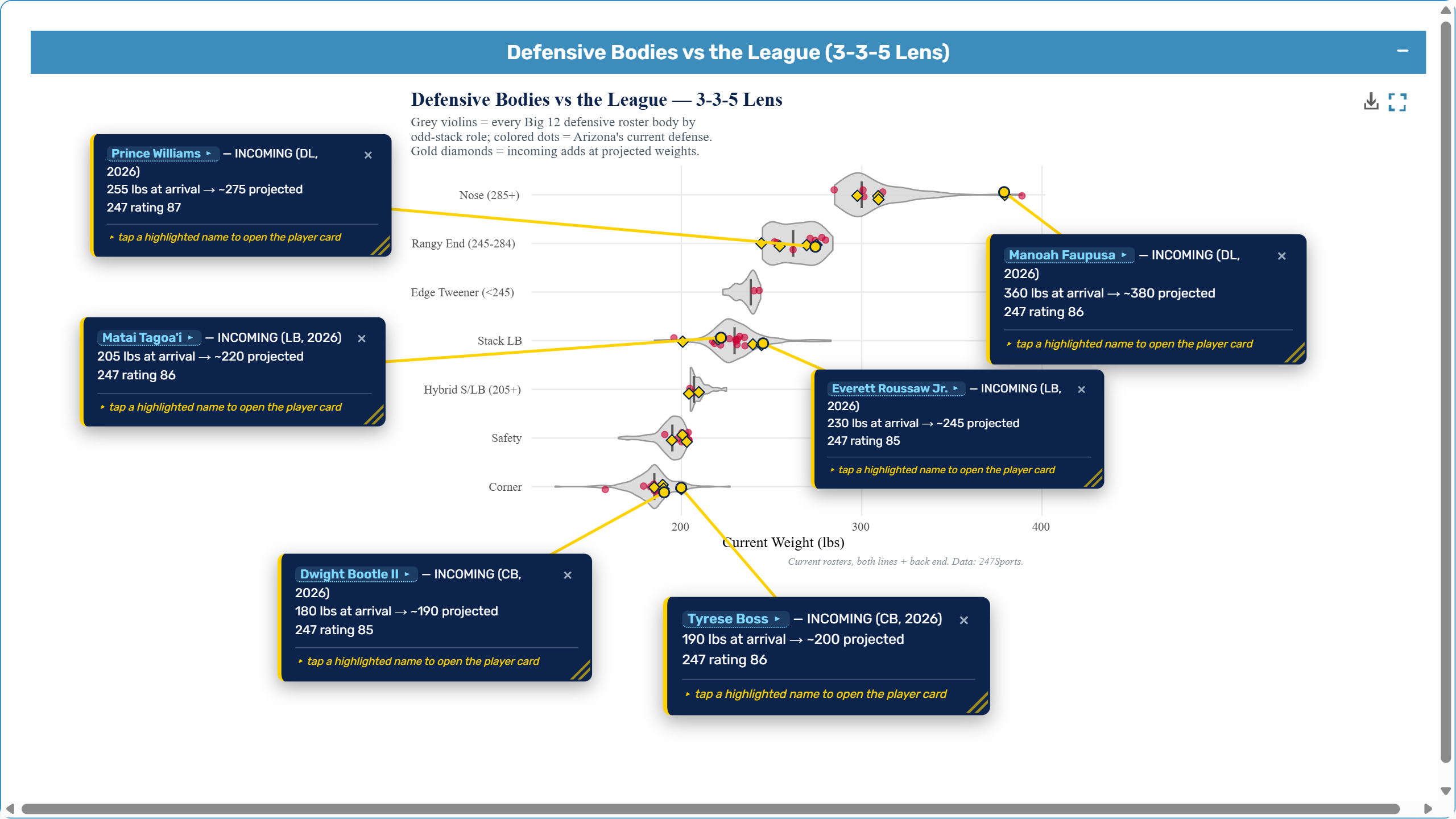
Big 12 Girth Index · Sports recruiting analytics
Dashboard R Shiny Web scraping Sports analytics
Every Big 12 recruit’s height, weight, and rating (2016 to 2026, football and basketball, all 16 programs) as interactive charts. Body maps, conference size leaderboards, player cards, talent-vs-results comparisons, and coaching-era breakdowns. Works on your phone.
16 Big 12 programs
2016–2026 recruiting data
More details
Highlights: custom scraping pipeline pulling recruiting classes and rosters from 247Sports (portal transfers included from 2021) plus season records and SP+ from CollegeFootballData, nine interactive visualizations (the Body Map, Conference Beef leaderboards, Player Cards, the War Room, Talent vs Results, and Coach Eras) with on-chart annotation and image export.
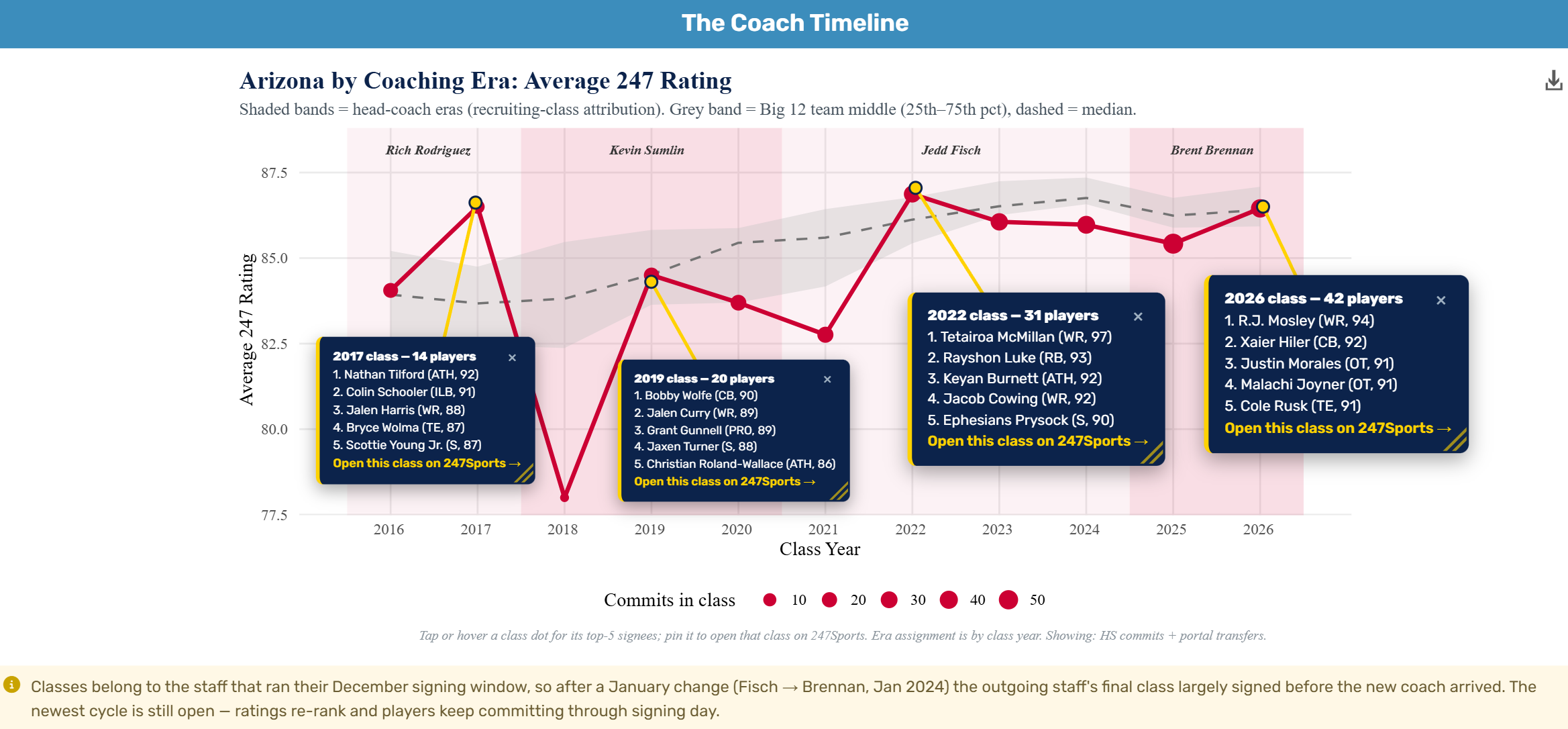
The Coach Timeline credits each recruiting class to the staff that ran its December signing day, tracks Arizona’s average 247 rating against the Big 12’s 25th–75th percentile band across the Rodriguez → Sumlin → Fisch → Brennan eras, and re-ranks the newest class live as commits roll in.
04 · Data storytelling
Plants In Movies · Flora vs. fiction
Dashboard R Shiny USDA PLANTS data Data storytelling
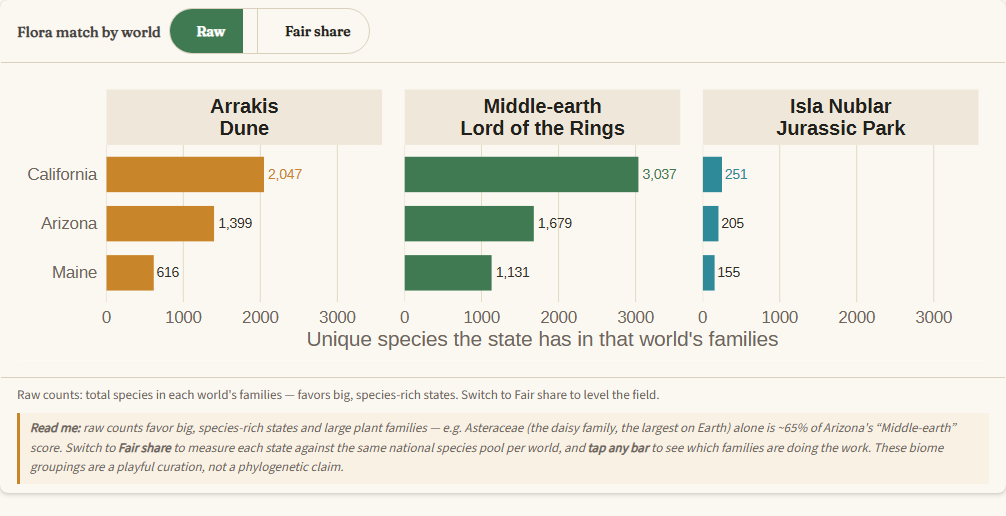
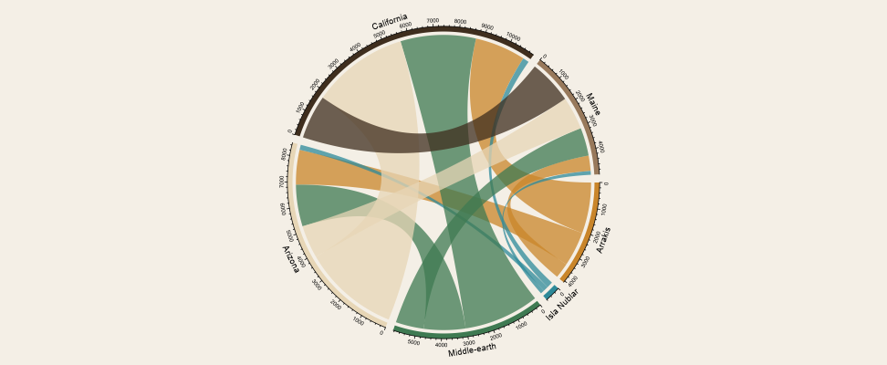
Which U.S. state’s plant life best fits three movie worlds: Dune (Arrakis), The Lord of the Rings (Middle-earth), and Jurassic Park (Isla Nublar), each defined by a curated set of plant families (desert & succulent, cool-forest & alpine, and ancient ferns & conifers). Pick any states and an interactive bar chart ranks their flora against each world; tap a bar to see which families drive the score, and toggle Raw counts → Fair share to control for the fact that big, species-rich states and giant plant families would otherwise dominate. A chord diagram then maps the species each state shares with every world.
~250K USDA PLANTS records
3 movie worlds
More details
A full rebuild of the original: an honest, size-adjusted metric and a botanical field-guide redesign. The Fair share toggle controls for the fact that Asteraceae alone is ~65% of Arizona’s “Middle-earth” score, so big states and giant families don’t automatically win. Built on ~250,000 USDA PLANTS records precomputed into an ~11 KB bundle so it loads instantly.
05 · ETL pipeline
VGS Batch Importer · ETL pipeline for rangeland data
ETL & QA R Shiny SQLite USFS / Agriculture
An R-based ETL pipeline that ingests historical Excel datasheets into a SQLite database for VGS (used across USFS rangelands), with embedded QA checks that catch corrupt or incomplete rows before they hit the database.
More details
Supports multiple protocols (point ground cover, line intercept, nested frequency).
Highlights: USDA species-code validation across all 50 states, USFS shapefile-based site renaming (Region → Forest → Ranger District → Allotment → Pasture), batch-import of dozens of Excel files at once, automated comparison and correlation reports.
Want to see something similar built for your data?
The best case study is the one we build for you. Tell us your problem and we’ll scope it.
